Chapter 8.6 The Correlation
The Correlation
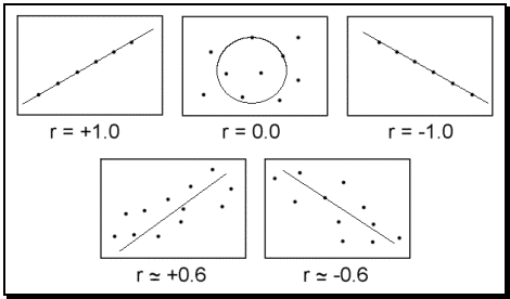
The correlation is one of the easiest descriptive statistics to understand and possibly one of the most widely used. The term correlation literally means co-relate and refers to the measurement of a relationship between two or more variables. A correlational coefficient is used to represent this relationship and is often abbreviated with the letter ‘r.’ A correlational coefficient typically ranges between –1.0 and +1.0 and provides two important pieces of information regarding the relationship: Intensity and Direction.
Intensity refers to the strength of the relationship and is expressed as a number between zero (meaning no correlation) and one (meaning a perfect correlation). These two extremes are rare as most correlations fall somewhere in between. In the social sciences, a correlation of 0.30 may be considered significant and any correlation above 0.70 is almost always significant. The absolute value of ‘r’ represents the intensity of any correlation.
Direction refers to how one variable moves in relation to the other. A positive correlation (or direct relationship) means that two variables move in the same direction, either both moving up or both moving down. For instance, high school grades and college grades are often positively correlated in that students who earn high grades in high school tend to also earn high grades in college. A negative correlation (or inverse relationship) means that the two variables move in opposite directions; as one goes up, the other tends to go down. For instance, depression and self-esteem tend to be inversely related because the more depressed an individual is the lower his or her self-esteem. As depression increases, then, self-esteem tends to decrease. The sign in front of the ‘r’ represents the direction of a correlation.
Figure 8.6: Scatter plots for sample correlations
Scatter Plot.
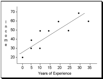
Correlations are graphed on a special type of graph called a scatter plot (or scatter gram). On a scatter plot, one variable (typically called the X variable) is placed on the horizontal axis (abscissa) and the Y variable is placed on the vertical axis (ordinate). For example, if we were measuring years of work experience and yearly income, we would likely find a positive correlation. Imagine we looked at ten subjects and found the hypothetical results listed in Table 8.2.
Table 8.2: Sample Correlation Data
Subject Number
Experience in Years
Income in Thousands
Subject Number
Experience in Years
Income in Thousands
1
0
20
6
15
50
2
5
30
7
20
60
3
5
40
8
25
50
4
10
30
9
30
70
5
10
50
10
35
60
Notice how each subject has two pieces of information (years of experience and income). These are the two variables that we are looking at to determine if a relationship exists. To place this information in a scatter plot we will consider experience the X variable and income the Y variable (the results will be the same even if the variables are reversed) and then each dot will represent one subject. The scatter plot in Figure 8.7 represents this data. Notice how the line drawn through the data points has an upward slope. This slope represents the direction of the relationship and tells us that as experience increases so does income.
Figure 8.7: Scatter Plot for Sample Data
Correlation and Causality.
One common mistake made by people interpreting a correlational coefficient refers to causality. When we see that depression and low self-esteem are negatively correlated, we often surmise that depression must therefore cause the decrease in self-esteem. When contemplating this, consider the following correlations that have been found in research:
Positive correlation between ice cream consumption and drownings
Positive correlation between ice cream consumption and murder
Positive correlation between ice cream consumption and boating accidents
Positive correlation between ice cream consumption and shark attacks
If we were to assume that every correlation represents a causal relationship then ice cream would most certainly be banned due to the devastating effects it has on society. Does ice-cream consumption cause people to drown? Does ice cream lead to murder? The truth is that often two variables are related only because of a third variable that is not accounted for within the statistic. In this case, the weather is this third variable because as the weather gets warmer, people tend to consume more ice cream. Warmer weather also results in an increase in swimming and boating and therefore increased drownings, boating accidents, and shark attacks.
So looking back at the positive correlation between depression and self-esteem, it could be that depression causes self-esteem to go down, or that low self-esteem results in depression, or that a third variable causes the change in both. When looking at a correlational coefficient, be sure to recognize that the variables may be related but that it in no way implies that the change in one causes the change in the other.
Specific Correlations.
Up to this point we have been discussing a specific correlation known as the Pearson Product Moment Correlation (or Pearson’s r) which is abbreviated with the letter ‘r.’ Pearson is the most commonly cited correlation but can only be used when there are only two variables that both move in a continuous linear (straight line) direction. When there are more than two variables, when the variables are dichotomous (true/false or yes/no) or rank ordered, or when the variables have a nonlinear or curved direction, different types of correlations would be used.
The Biserial and Point Biserial Correlations are used when one variable is dichotomous and the other is continuous such as gender and income. The phi or tetrachoric correlations are used when both variables are dichotomous such as gender and race. And finally, Spearman’s rho correlation is used with two rank ordered variables and eta is used when the variables are nonlinear.