24: Sample Distribution
Sample Distribution
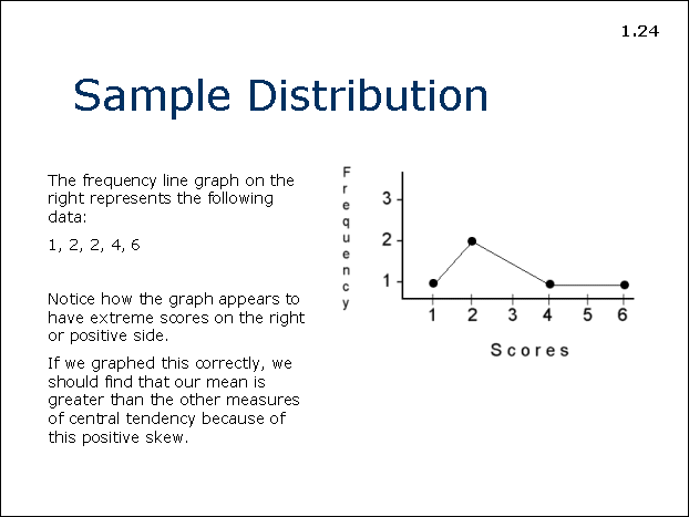
The frequency line graph on the right represents the following data:
1, 2, 2, 4, 6
Notice how the graph appears to have extreme scores on the right or positive side.
If we graphed this correctly, we should find that our mean is greater than the other measures of central tendency because of this positive skew.